Create a Retro-Style Layout with Jack & Skelly!
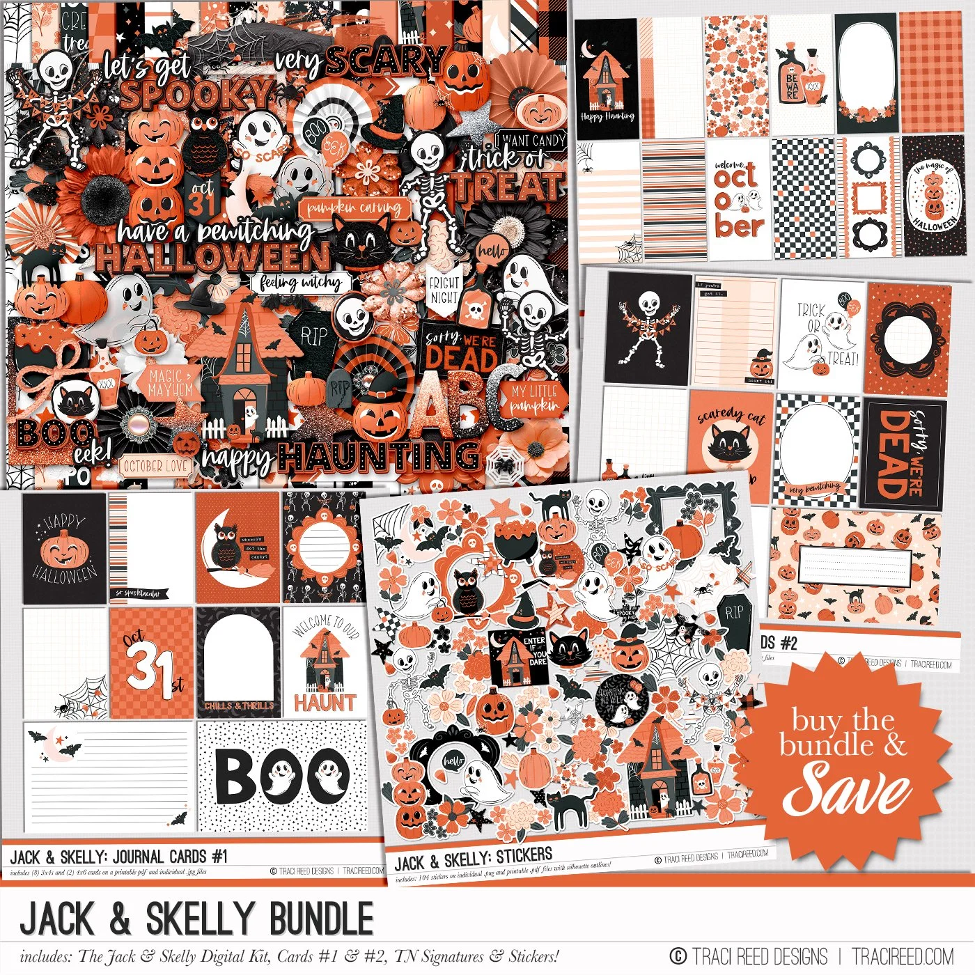
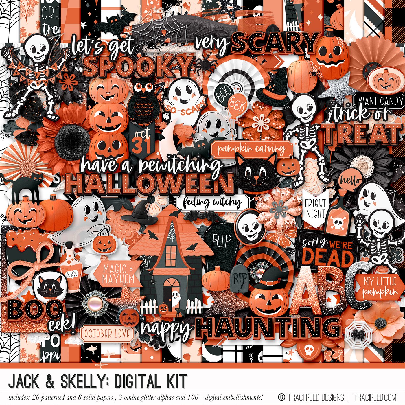
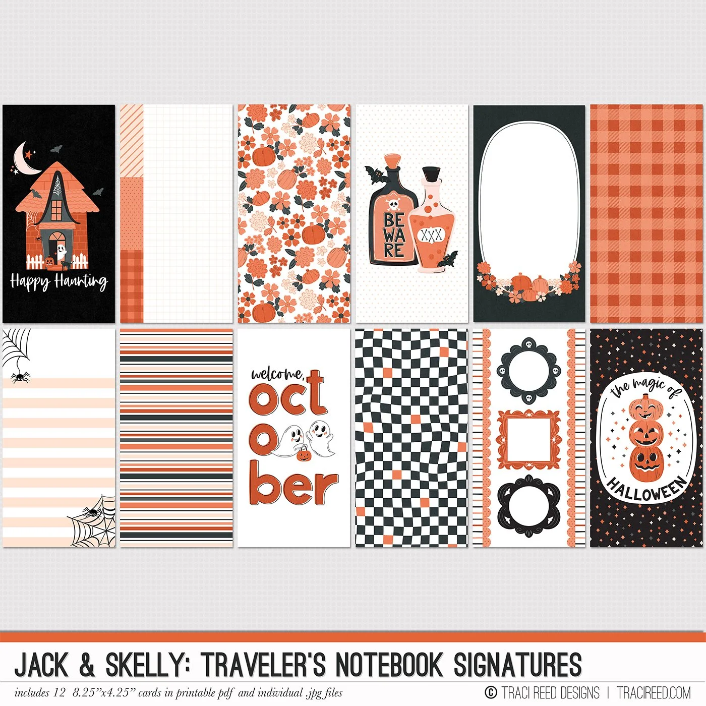
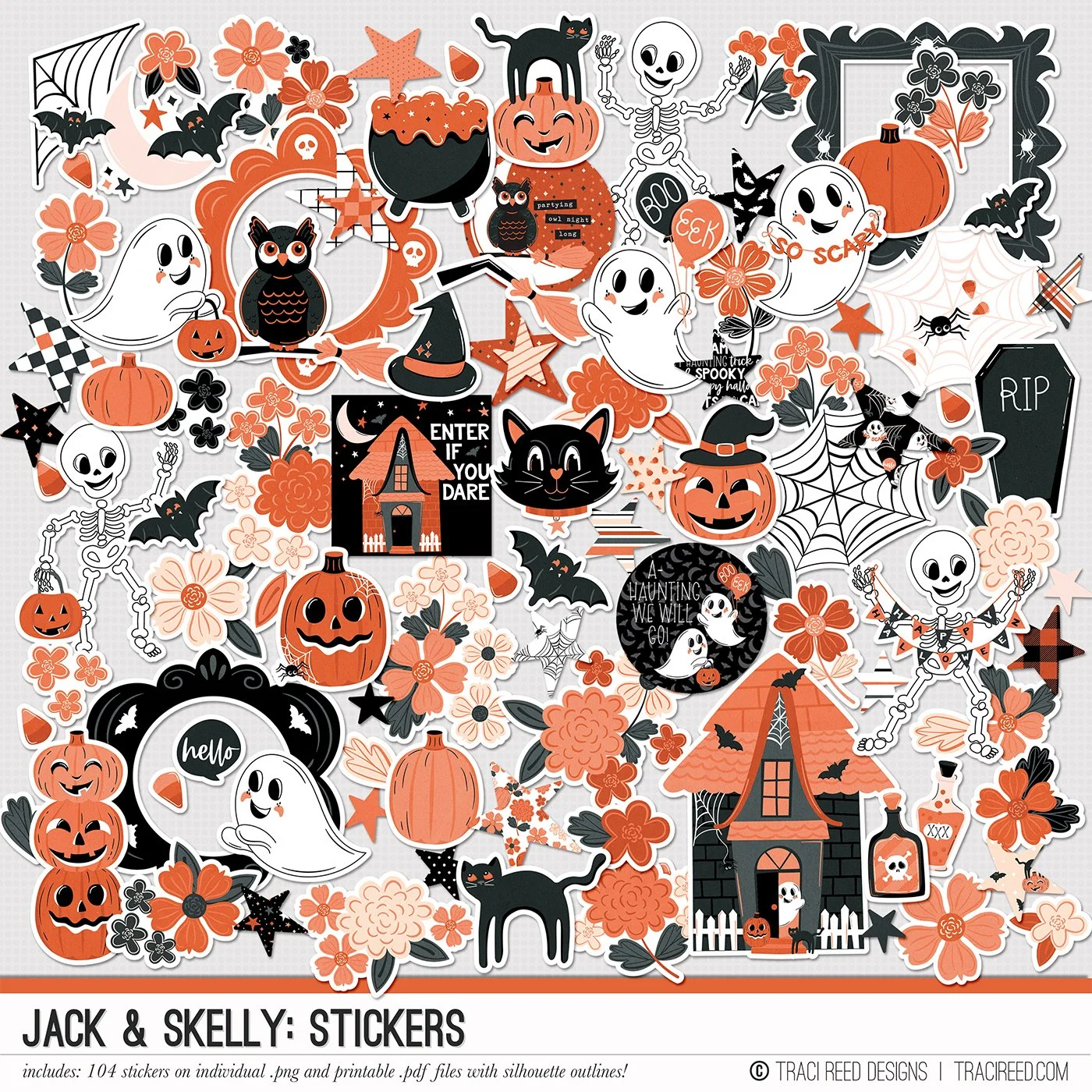
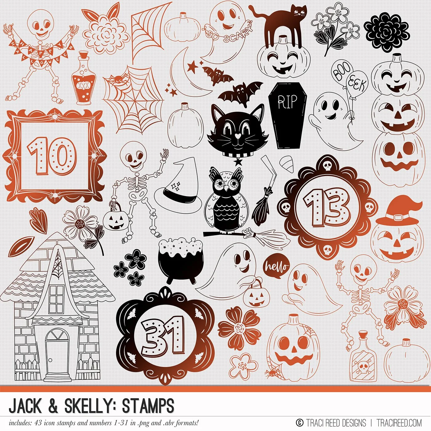
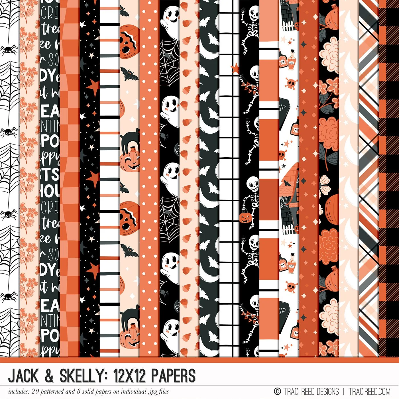
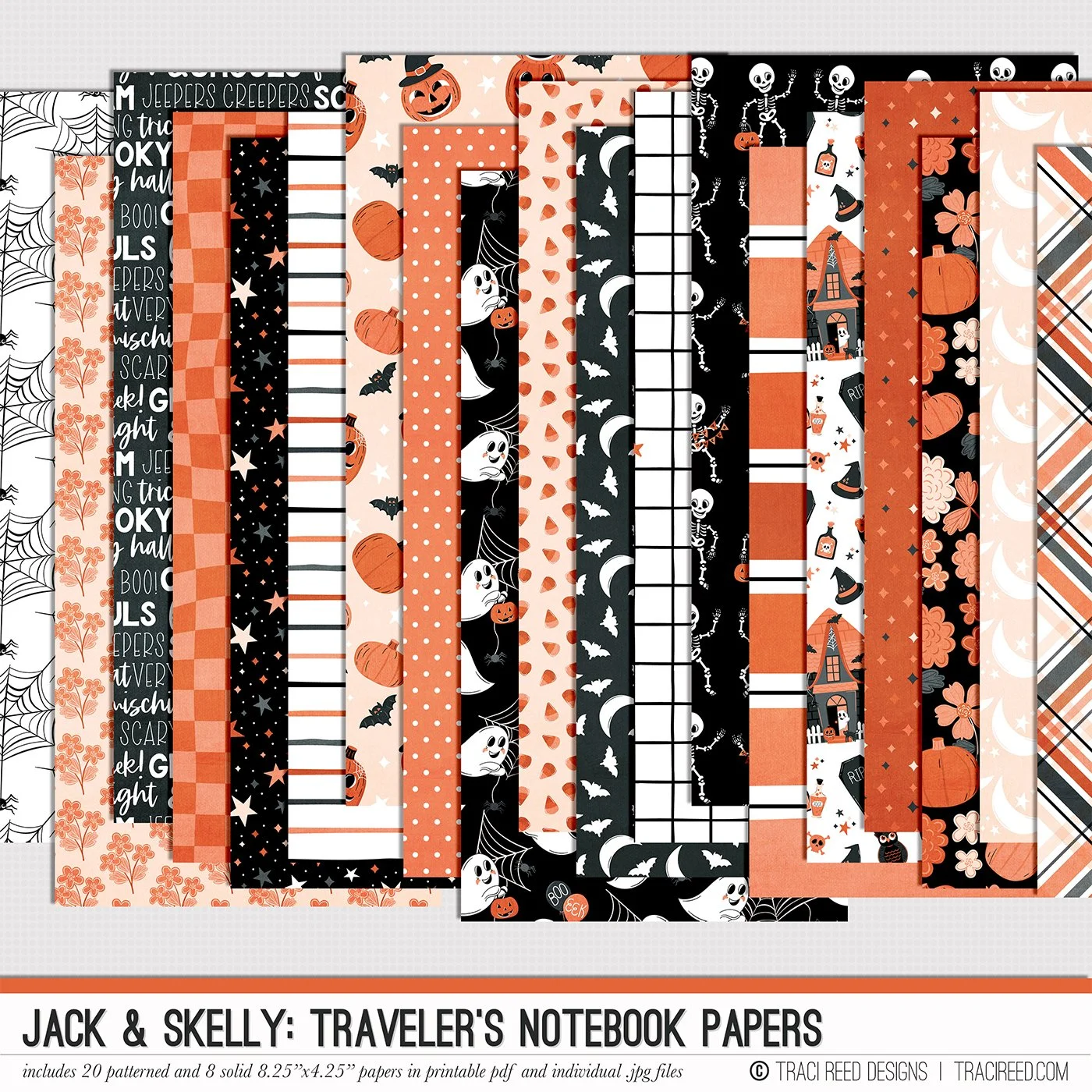
Hey everyone! It’s Cheryl here to share a layout featuring the new Jack & Skelly Collection by Traci Reed Designs. This collection is brimming with Halloween fun—think candy, costumes, and trick-or-treating! I previously used it for a layout with a selfie from last year, but I was inspired to create a retro-style layout because of Traci's charming vintage illustrations.
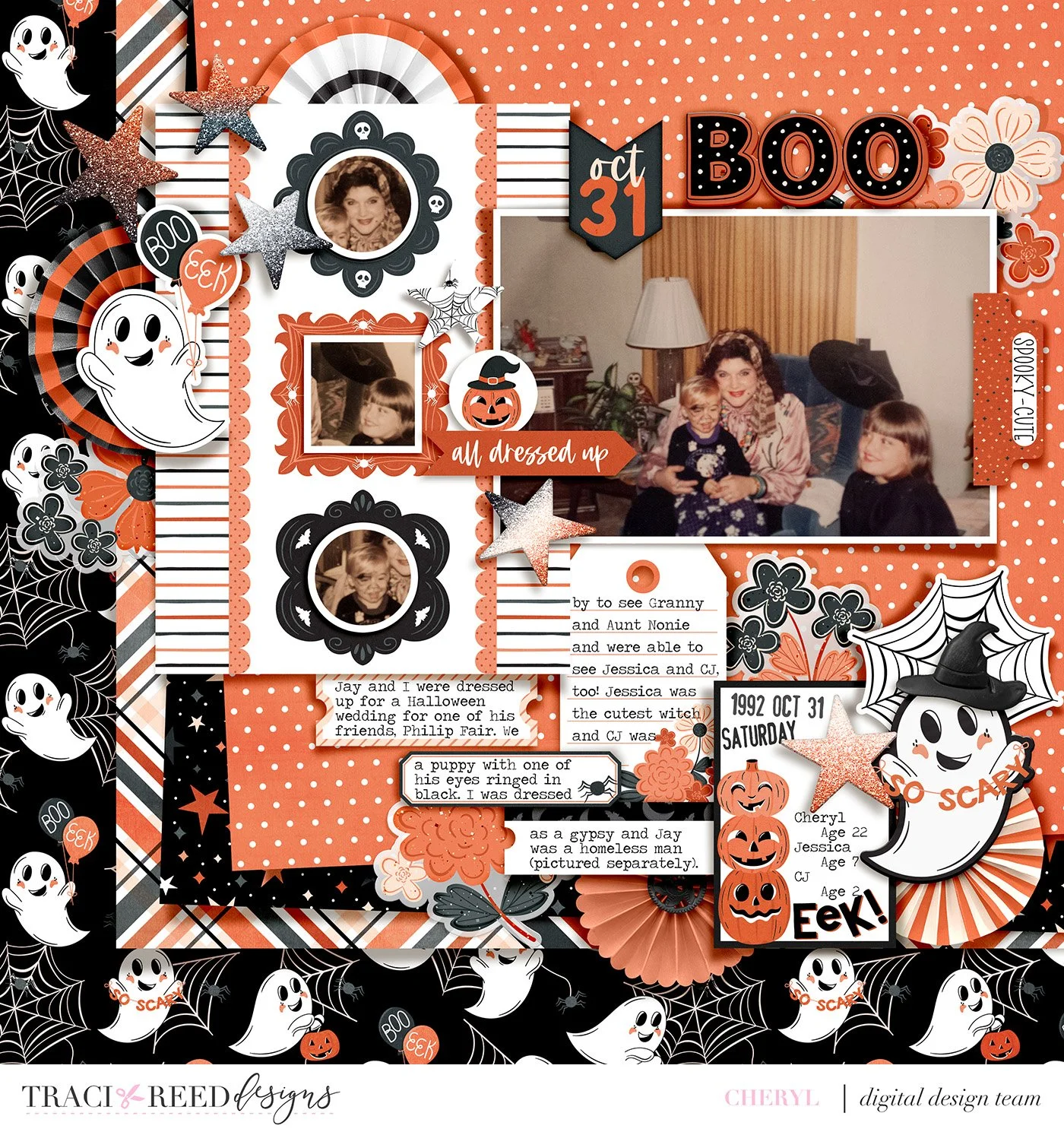
For today’s layout, I chose a photo from 1992 (wow, that really is retro!). It features me, my sister Jessica, and my brother CJ. I edited the photo to create one large full-color image and a slightly smaller sepia-toned version, which I duplicated for a total of three sepia images.
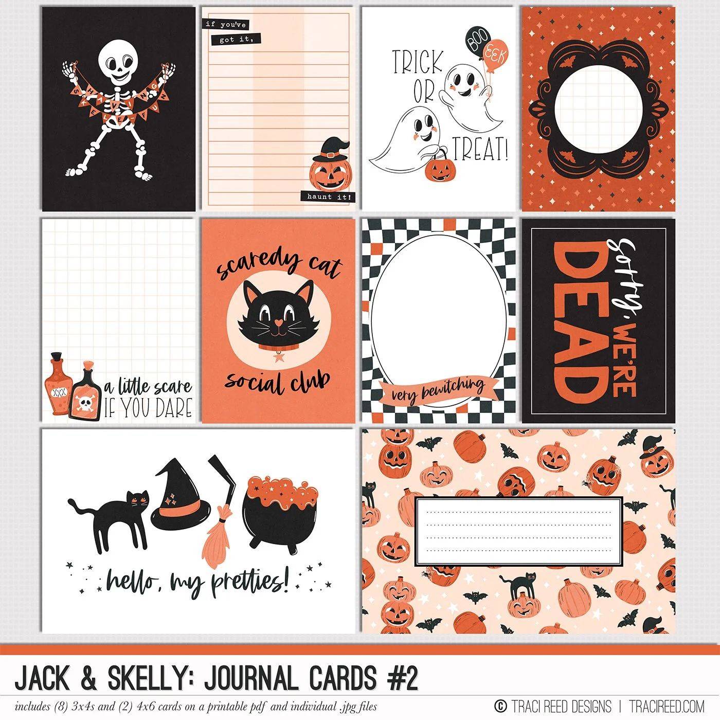
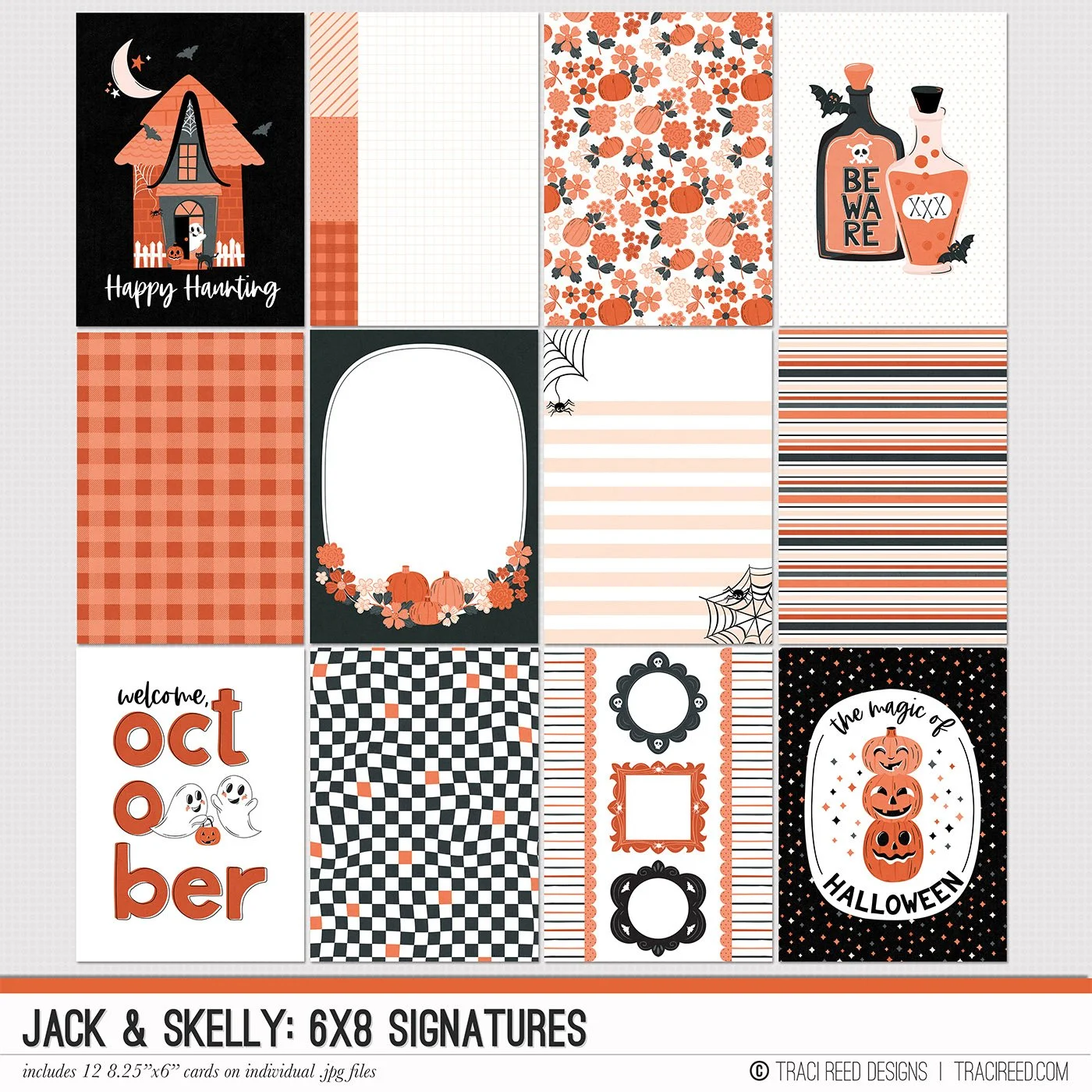
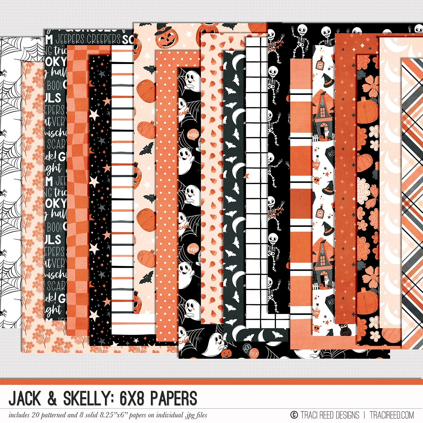
I opted for a 6x8 signature card and used the magic wand tool in Photoshop to select the interiors of the frames, allowing me to place close-up photos of the three of us inside. After selecting the areas, I used the CTRL+J shortcut to duplicate the frame interiors, making it easy to clip my photos to the shapes. I also added a white border around the smaller photos to help them pop.
With a strong angle established by the signature card and the larger photo, I positioned them in the center/upper right section of my 12x12 canvas. I chose four different patterned papers for the layered background, placing them from the upper right corner and slightly rotating each one to showcase the designs while balancing the photos.
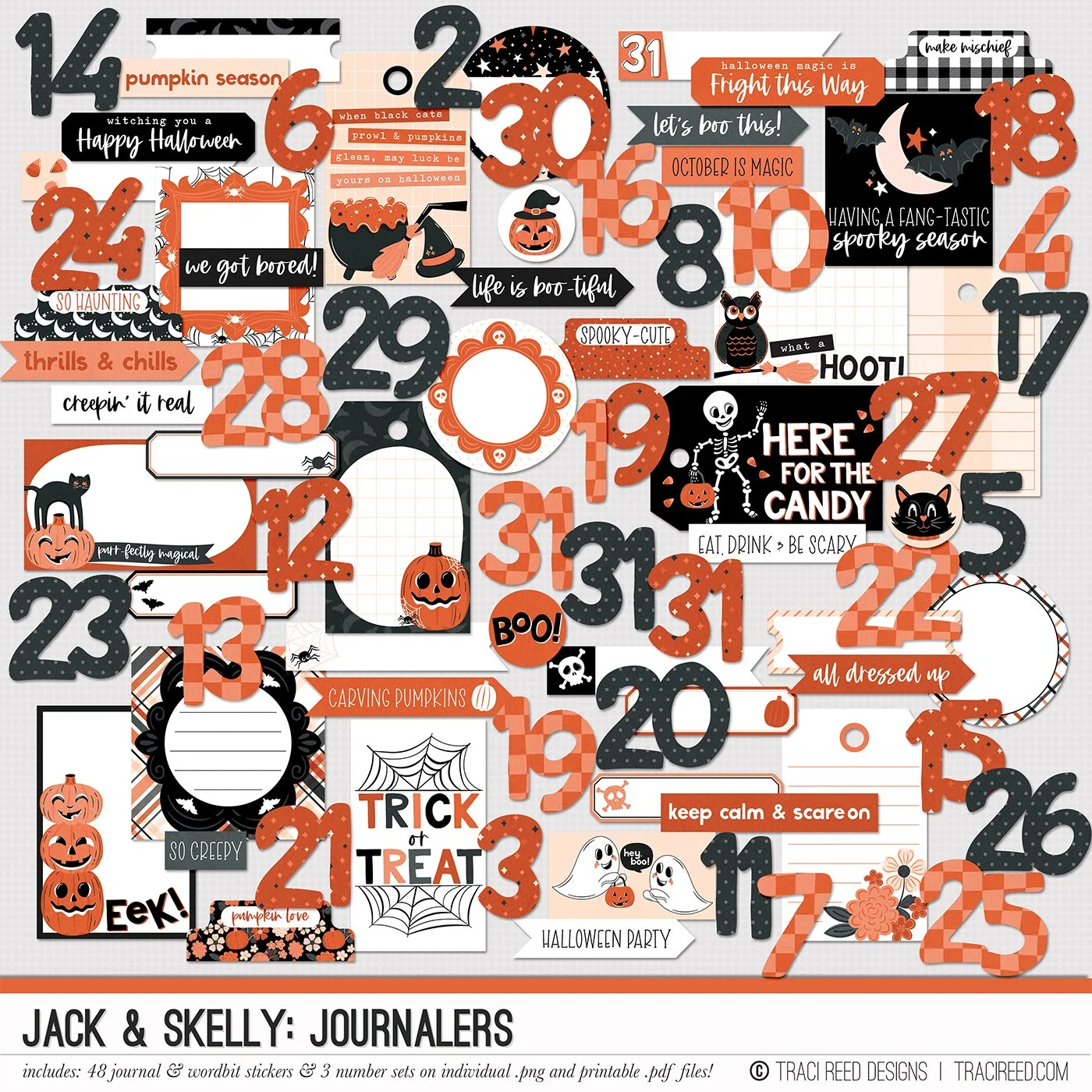
Now comes my favorite part: browsing through the embellishments and picking out the ones that resonate with me! I typically don’t move items around once placed, but as you can see in my video, I did a bit of rearranging. I added a pre-made title ("BOO") at the top, along with labels and a tag for my journaling between the signature card and the lower right cluster. I made sure to capture all the memories I could recall, including our ages.
Process Video
The Jack & Skelly Collection

