5 Tips for Designing on a Diagonal with Cheryl
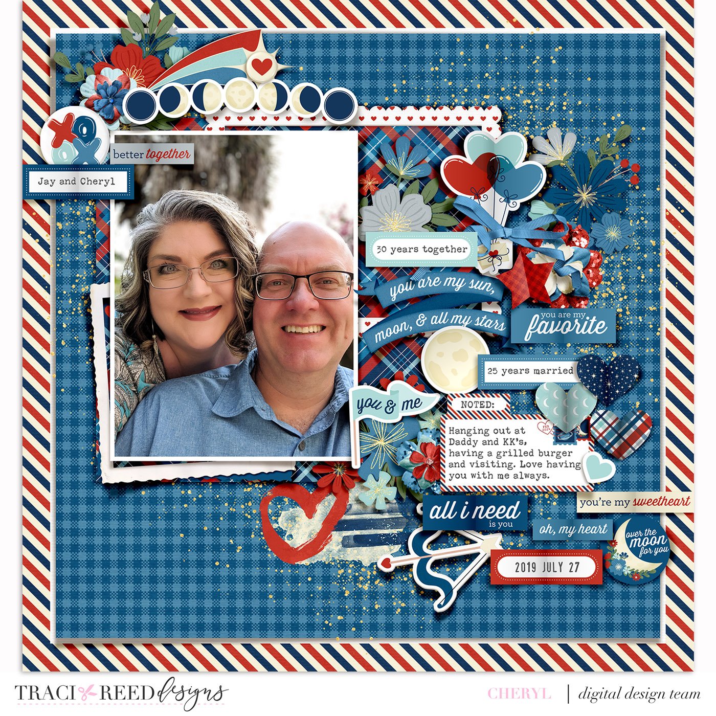
Hey y’all! It’s Cheryl @watchcherylscrap sharing a layout with the Over The Moon collection This collection is romantic but with a fun and fresh color palette. I chose to pair this collection with a photo of me and my husband taken while hanging out for burgers at my dad’s house.
I started with a blue gingham pattern along with my photo because of the color shirt my husband is wearing. I realized fairly quickly in my creative process that I needed a stronger background. The paper in the background has a fabulous striped paper edge and has a white middle with some stamps. It was covered up with the blue gingham paper that I reduced to 90% size, leaving only a thin white border and the striped edge.
I placed my photo on the upper left for this creative session. I was really enjoying using all the stickers, word art, flowers, and frames. My layout began to take on a diagonal composition. I find that when I’m in my zone of creating, I fall back to my favorite compositions, and this layout was no exception. There are many times when I attempt more complicated compositions, but not this time! Sometimes it’s awesome to just sit down and create, trusting your instincts on placement, and Traci’s collections make that such an easy thing to do!
5 Tips for Designing on the Diagonal:
Choose the Right Background: Start with a solid or simple tonal paper as your base. This sets the stage for your diagonal design and provides a simple backdrop for your layout to let the embellishments shine.
Layer Diagonal Elements: Arrange your photos, papers, and embellishments on the same diagonal line across your page to create movement and flow, overlapping elements and varying sizes add visual interest and depth to your design.
Use Diagonal Lines: Incorporate diagonal lines or patterns throughout your layout to guide the viewer's eye and enhance the sense of movement. This can be achieved through patterned papers (like the postal strip here), washi tape, or embellishments.
Experiment with Angles: Don't be afraid to tilt your photos and embellishments at different angles to fit the diagonal theme. Play around with placement until you find the perfect arrangement that highlights your memories effectively.
Balance with Straight Lines: While diagonal elements add energy to your design, it's essential to balance them with straight lines and horizontal/vertical elements. This helps create stability and prevents the layout from feeling too chaotic, don’t tilt EVERYTHING on your layout!
If you’d like to see my process for this layout, you can view them on my Watch Cheryl Scrap YouTube channel or on my Instagram @watchcherylscrap


