TRD Sketchy Sunday #51
Hey Hey Hey! We’re back with another fantastic sketch prompt for you today and the team is just FULL of inspiration! Check it out!
Click HERE to download a printable PDF file of the sketch!
Traci - Island Time
This is such a fun sketch and I knew it deserved the bold color from the Island Time collection, so I went all in with that woodgrain stripe and even layered some of the digital mixed media over the top! I stuck closely to the sketch (after all, I made it!) and embellished with some additional paint and sequins for fun!
Process Video
Ronelia - Island Time
For Sketchy Sunday #51 I decided to translate the 12x12 sketch into a Travelers Notebook size layout. This was more challenging than I expected because the body of the sketch falls over 2/3 of the page, which meant in reality that one of my polaroid photos would be cut in half. So, I adjusted the sketch to span across both pages more, while keeping my two photos on the left. I like how it ultimately turned out, plus I so enjoyed documenting these two polaroids of our new puppy Ivy.
Caroline - Autumn Enchantment
I decided to work with the Autumn Enchantment collection and at 12 X 12 size for this sketch which is unusual for me as I tend to change the sketch to suit a Traveller’s Notebook. As I don’t have a large format printer at home I opted to have white card stock for my background , with two strips of A4 paper layered up for the torn edge on the right. I then created some layers behind my photos using papers from the collection. Before I adhered these down, I did some ink splatter in the centre of the card stock and then started to stick. I cut myself some frames from papers in the collection because I really liked that look on the sketch. I did deviate a little from the areas of embellishment - choosing to go with three main areas and then a fourth over on the right to hide where I had joined my paper layers together. I love this page and I’m so happy that I chose to work with Autumn Enchantment as the motifs and word phrase elements really matched the story I wanted to tell. Looking forward to see what the rest of the team have done with this sketch.
Becky - Aflutter
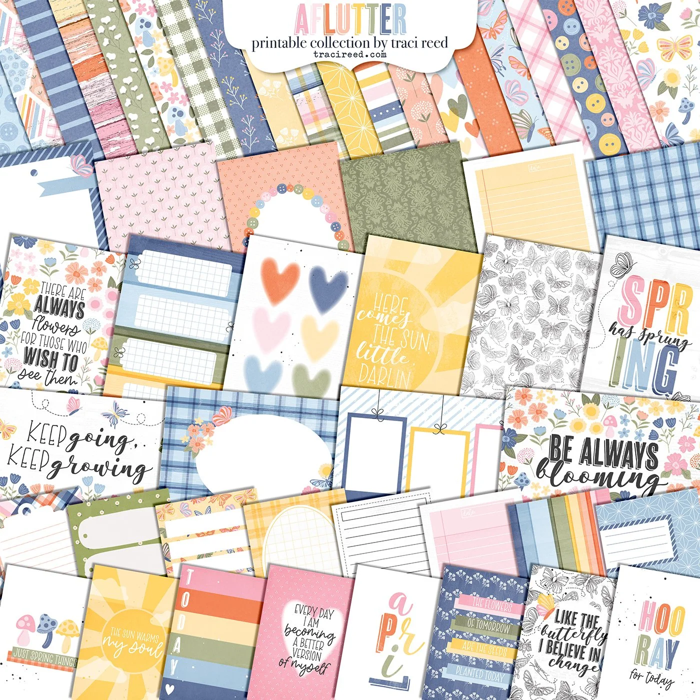
I love to use a sketch as a jumping off point for a layout but in this case I stuck to it almost exactly! I used Aflutter as the colours were perfect for my photos and I moved away from the sketch a little as I had 3 photos I wanted to use instead of the two in the sketch. I replaced the journalling box with a photo and just added my journalling below the horizontal photo. The frames I used were from the digital collection but all the other embellishments are from the sticker pack and I printed the butterflies in various sizes and curled the wings on some and raised the wings with foam pads on others. A few flowers printed on vellum were also tucked under some of the clusters. I hope you give this sketch a go and do tag Traci if you do!
Luly - My Story Matters
I always love to use sketches and templates when I create pages – I love have a broad variety in my albums – especially my yearly albums. Traci’s sketch was perfect to start documenting a magical few days in Walt Disney World. I started with my favorite pics with the characters – especially Donald (because I am obsessed with him!) I used My Story Matters kit – there are a lot of fun colors but aren’t necessarily strictly “Disney” themed and I love the graphic plus signs and frames as a way to move your eye through the design. The sketch even gave me 2 spots to add pockets cards which always one of my favs!
Torey - My Oasis
When I saw this sketch from Traci, I immediately had knew I needed to give it a go! I loved the whole sketch so much that I didn’t stray too much away from the original design and only made a few tweaks here and there. Since I can only print up to an 8.5x11 size, I decided to add another torn layer to get my width up to 11” and mount my 11” square on a plain black piece of cardstock.
I used the beautiful and neutral My Oasis collection for my layout. I chose flowers and buttons from the digital kit as my embellishments to lay around my spread. I also chose to trim up some labels and ink up their edges to use as faux word strips, as I wanted to sprinkle a little more of the green around. For my journaling, I made a tag from a scrap of my plaid paper and added a very dimensional bow to it!
This was such a fun sketch and it has the potential for so so many great results!!


