Scraplift Saturday - Digital Team Member Danica!
Happy Scraplift Saturday!! Today we’re lifting one of my long-time team members Danica for a second time! Danica is so prolific and talented, I couldn’t resist dipping back into her gallery a second time for inspiration!
Trish, Chantal, Heather and Leah all have gorgeous inspiration ahead for you!
Make sure you tag me on Instagram if you play along and use the hashtag #TRDScrapLiftSaturday!
Chantal - Smitten
Danica used 2 big clusters on het page. I wanted to recreate that. To give mine a bit more balance, because I used smaller clusters, I added a small third one.
Danica also used a paper as background with lots of mixed media. So I also added a bit of stenciling and splatters.
My printer only is a4 so my paper isn't big enough t cover the whole side of the page. But with the torn edges it doesn't matter. A lift is a starting point and doesn't have te be an exact copy ;)
The collection I used is Smitten. The color combo of this collection is my favorite.
Chantal scraplifted this layout of Danica’s using the Smitten collection! Danica’s layout uses the Felicity Collection!
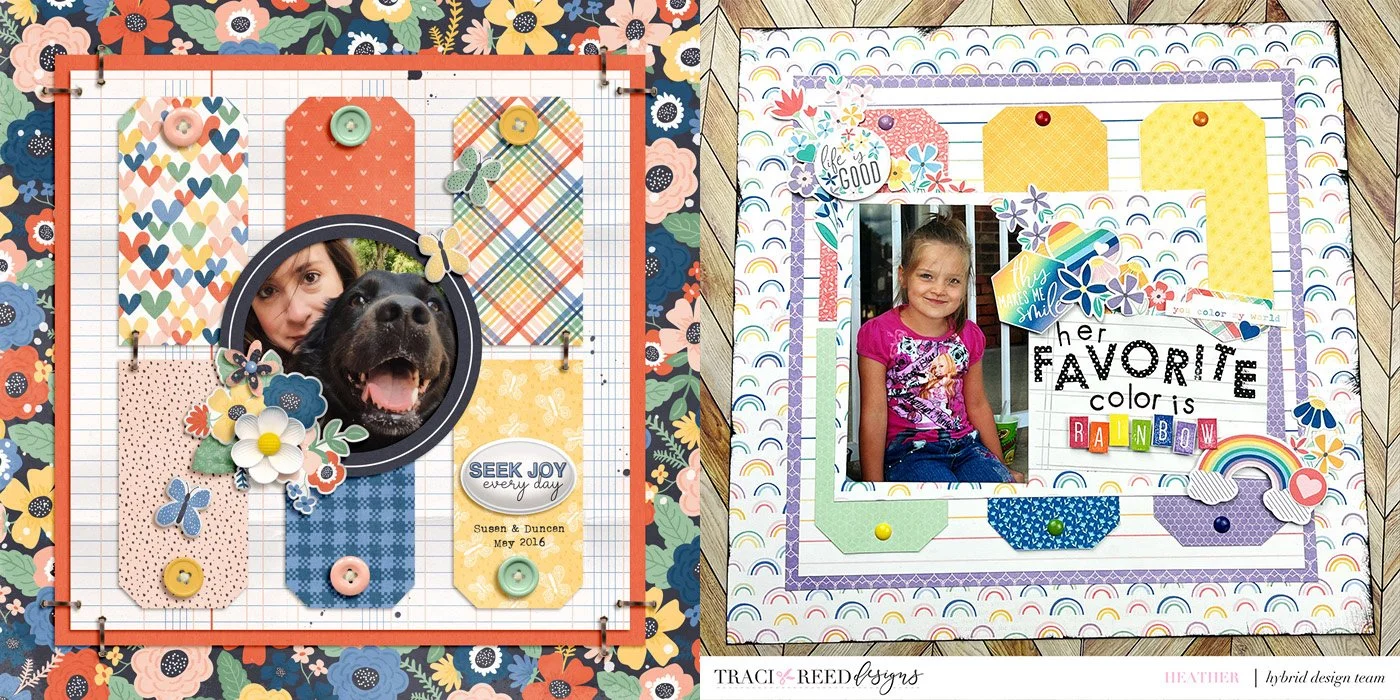
Heather - Keep Chasing Rainbows
I love being inspired by other scrapbookers, and choosing a layout to lift from Danica’s many beautiful layouts was no easy task. I finally decided to use the layout I chose, because I loved the tag background elements. I used the Keep Chasing Rainbows collection, and I kept true to Danica’s design for the background. Then put my own spin on things by adding a larger photo and a diagonal embellishment line. I stamped the title, and I could not be more in love with the end result.
Heather scraplifted this layout of Danica’s using the Keep Chasing Rainbows collection! Danica’s layout uses the Time to Thrive Collection!
Leah - Renewal
While browsing Danica’s beautiful gallery, this adorable layout caught my eye. I love how she scrapped on the upper third of the page. As always, she did an awesome job not only on the clustering but also on the layering of papers. I really like the use of torn paper which definitely added texture to her layout. Lastly, I think that cute bumble bee next to the title is a perfect finishing touch.
For my lift, I flipped it so the weight is at the bottom of the page. In addition to the stacked papers, I also used two identical photos on top of each other. The torn paper, curled ribbon, and strings provide the texture I want to achieve. Of course, I had to include the cute butterfly to complete the page.
Leah scraplifted this layout of Danica’s using the Renewal Collection with a touch of Wildflower!
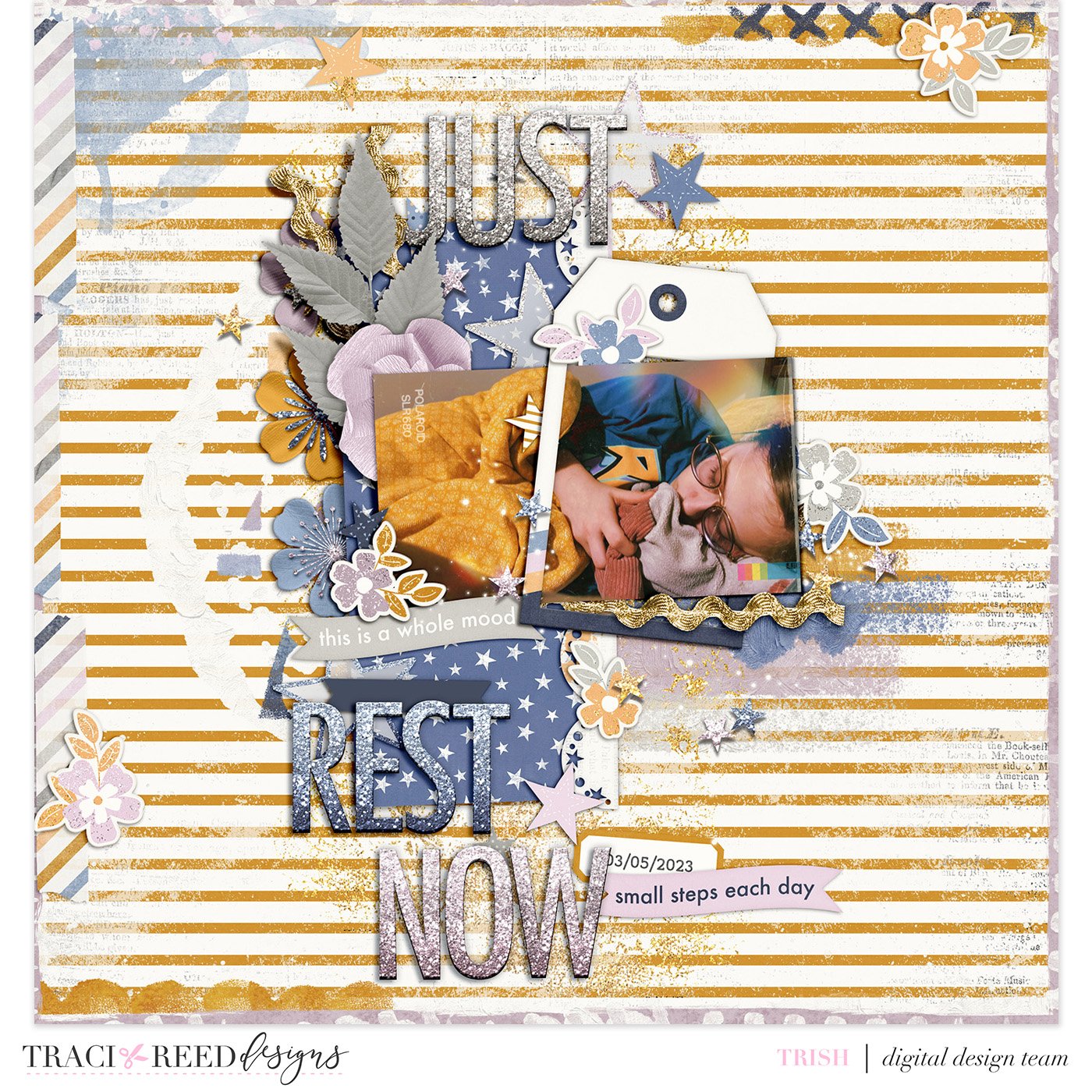
Trish - Renewal
I was so excited to sign up to lift one of Danica’s pages because her layering is absolutely gorgeous. I decided to lift her layout “Fly” because there is just something about a messy center design that my heart just adores.
I used a photo of my daughter sleeping in my bed one night and paired it with Traci’s Renewal collection as the colors of the two just seemed to go so beautifully together, and the abundance of stars lent well to a sleeping theme.
Trish scraplifted this layout of Danica’s using the Renewal Collection!


