Mix It Up Monday: Hygge Season + Renewal
Hello and welcome to the Nineteenth edition of our fun series: Mix It Up Monday! Today the we’re combining Hygge Season and Renewal collections! Two very different collections but with complimentary color palettes, I wanted to see how the team would problem solve and they knocked it out of the park!
Check out the team’s examples below and I can’t wait to see you mix these three collections up too!

Cheryl
I started out my layout with a fantastic group selfie that I converted to black and white because the color version was very busy. I then reached for the Renewal Collection and began pulling in elements. I wasn’t picky at this point, but simply let instinct take over. From that point, I switched over to the Hygge Season Collection, Traci’s new release this month. I did the same thing and just began choosing things that spoke to me. After that, I went back and forth between the kits, picking items by color to balance my page or word art/word strips that I felt helped tell my story. I love that both collections had a nmber of pieces that meshed together very well.
My story Is this: On the night before my dad had open heart surgery, we went to his house to see him and pray for him because he was having to check in at 5 am in the morning. We said a quick prayer for him, and then headed to my sister’s house. She was out of town and my brother, his wife, and their two children were staying there overnight. My husband and my two children were there as well. My sister is a fabulous mixologist, and we missed her skills, but also her presence. We decided to grab a bottle from her bar and we took a selfie to send to her to let her know she was being missed. We almost didn’t get the selfie because we were laughing so hard.

Theresa
Hi friends, Theresa here with a surprising idea for mixing the Hygge Season and Renewal collections: Back to School! With four children, I have lots of back to school and first day layouts to make and Renewal made me think of New Year, fresh start. The first thing I look for with mixing two collections are commonalities, what are common colors and themes? With these collections, both had stars - perfect for school layouts - and both had blues, yellows, and oranges. Renewal also has a great set of numbers which were perfect for the background! I created two background papers in Photoshop, the first is the triangle patterned paper from Renewal, and second is a mixed media frame from Renewal that is layered over top of one of the patterned papers from Hygge and then blended out so that it mostly reads as white space. I printed out the strip of numbers from Renewal onto clear sticker paper, assembled everything, and then began adding all the fun bits and bobs that tell this whole story. My favorite element is the bear in the corner, with his reading glasses reading a good book!

Tracie
I love the blues in both of these collections and wanted to highlight those. I also wanted to combine the coziness of Hygge Season with the life right now elements of Renewal. That is our life right now with the cold and snow… lots of hygge season coziness!

Torey
The first thing I looked for when mixing up the Renewal collection with the new Hygge collection (after printing my photos of course) was a fairly neutral background that I can use to build off of with elements from both collections. I really loved the grey leafy pattern Traci included with the Renewal TN Signatures and created a base background page in photoshop with it. I then used the Hygge Season digital kit and added some of the elements from the kit (the stitches, washi, and the chipboard book stack) to my page before printing. I also chose a few more pieces from both digital kits to print out and add to my layout after printing. I really loved how well the blues in both collections worked with each other and how they looked with the grey leafy background so I tried to pull those blues in with the embellishments I chose as well!
Both of these collections worked out perfectly for telling an everyday story about setting up my various journals for January. I also loved that I can say the book stack at the bottom corner is meant to represent some of my journals for the year!

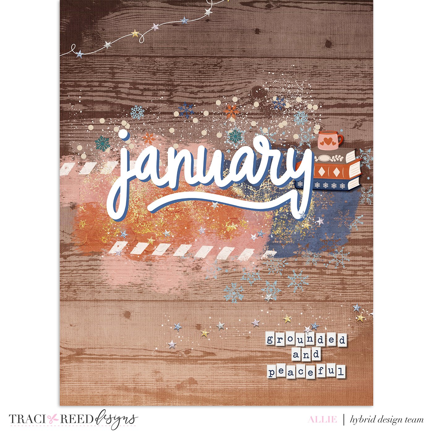
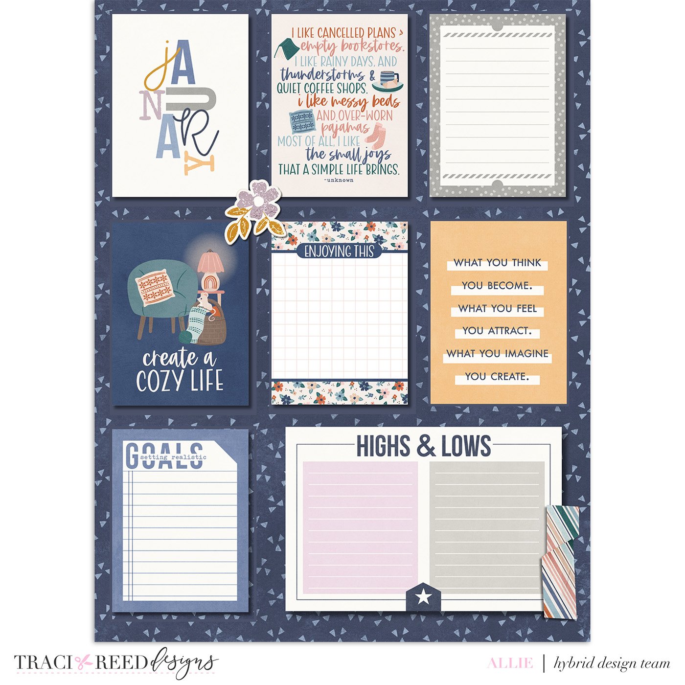
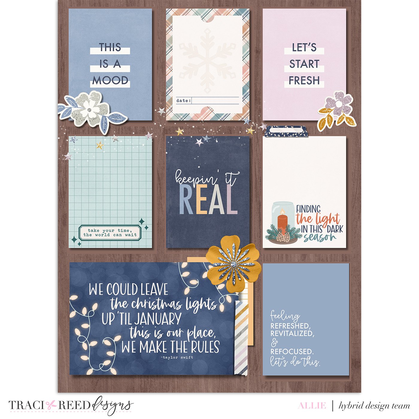
Allie
For combining these two fun “new year” collections, I went the “no photo” route and made some cute monthly dividers for my combination planner/scrapbook. I did the “January” monthly divider in a fun painty, art journal style, which was so easy to do with the fun mixed media elements in BOTH kits! Those colors just play so nicely together! I also did some insets for the planner that have spaces for journaling throughout the month— I’ll print and fill those out as I go! Since I like to use baseball card page protectors in my planner for little photos and bits, I mimicked that style for the journaling spot pages— but that also gave me a chance to use more of that amazing woodgrain paper that both kits feature! Best of all? I did all 3 of these pages in Canva! No fancy software needed!
TRD Products Used in This Post

